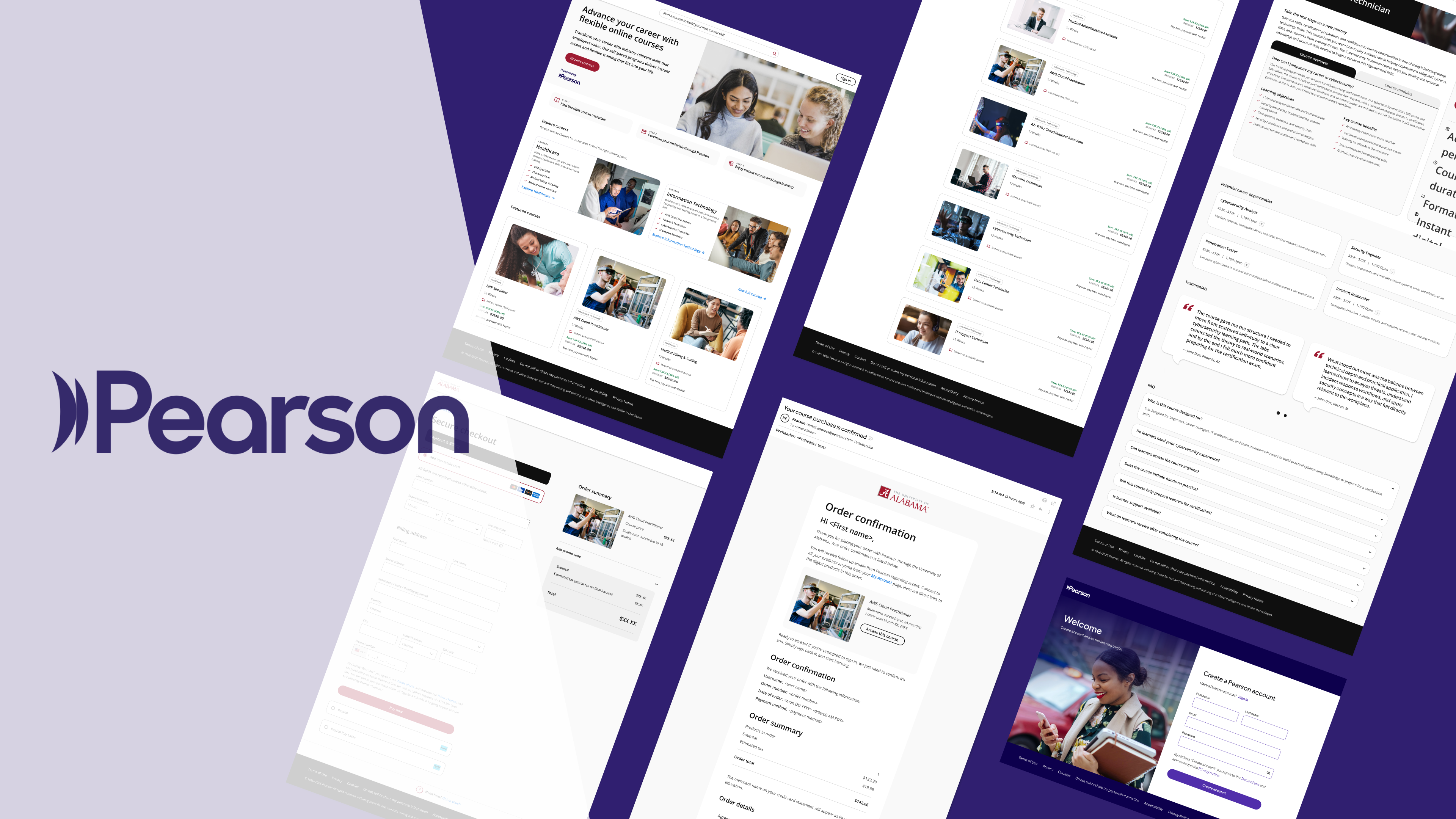
Pearson’s digital products had grown faster than the system behind them. We partnered with their teams to rebuild the design system and apply it to a new generation of pages — bringing one visual language to the places learners and educators actually use.
As product designer, I worked across both tracks of the engagement: evolving the design system — refreshed foundations, components, and usage guidance — and designing the new pages built on top of it. The work moved in lockstep with Pearson’s stakeholders, with system decisions pressure-tested against real page designs before they hardened into the library.
One system. Every page speaking the same language.
An updated foundation
We audited the existing library, kept what worked, and rebuilt what didn’t: refreshed type scales, an accessible color system, and components redesigned to flex across products instead of being rebuilt inside each one. Every piece ships with usage guidance, so the system teaches as it’s used.

The system, put to work
New page designs for Pearson’s client-facing experiences — built entirely from the updated system. Designing the pages and the system in parallel kept both honest: the pages proved the components could carry real content, and the system kept every page unmistakably Pearson.


Built to carry what comes next
Pearson’s teams now design and ship from one shared language: a system that scales across products, and pages that prove it. New work starts from the library instead of from scratch — faster to build, consistent by default.
